


By Melissa Dittmann Tracey
Is there a science behind selecting the right colors for your listings? In this month's Realtor® Magazine, I spoke with experts in the field of design psychology to learn how the color on the walls may affect buyers' moods. (Read the article: "Can Color Cost You a Sale?")
For years, psychological research has been offering insights into how the brain reacts to color choices. Such research is often tapped by the marketing field in making products more desirable to buyers.
Can these same studies be applied to motivating such big purchases as a home? It's a leap, but at a subconscious level, certain colors on walls may evoke buyers who enter a home to feel more welcoming and even warmer (which may be particularly nice for rooms in chilly areas of the home).
A recent study by lead researcher Juliet Zhu of the University of British Columbia found that red seems to improve attention to detail. (The findings appeared this month in the journal Science.) The researchers speculated that we're taught at a young age that red means danger so red might slow us down and prompt us to zoom in on details (so would that make it a good choice for, say, surrounding the fireplace or to bring out other key details in your listing?).
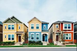
While color preferences and psychological responses vary, research has revealed some of the following commonalities, according to The Rohm and Haas Paint Quality Institute and Architects Design Group (also included below is suggestions of what rooms the color may work best in).
- Red: Increases energy and heart rate, creates excitement and stimulates the appetite. Best for: Dining rooms
- Orange: Adds comfort, warmth, and cheerfulness and too much can bring about feelings of cautiousness. Best for: Living rooms and
family rooms
- Yellow: Brightens mood and promotes welcoming and joyful feelings; increases positive thinking. Best for: Poorly lit foyers and dark hallways; buttery shades of yellow for living rooms
- Green: Most restful color. Reduces nervous system activity and muscular tension, calms and relaxes, offers reminders of nature. Best for: Living rooms (light greens); accent for kitchens and dining rooms (midtones).
- Blue: Promotes feelings of calmness, security, tranquility, and cleanliness; lowers blood pressure, cools a room, and serves as an appetite suppressant. Best for: Bedrooms or any restful, peaceful area in a home.
- Purple: Boosts creativity, imagination, and meditation, but can have unpleasant subconscious responses. Many adults dislike purple walls, particularly lighter shades of purple that are perceived as more youthful. Best for: Children's bedrooms and play areas.
So, what do you think? Should science guide our paint choices?