


Home owners say they like color in their homes but they definitely have some hesitations in using it to decorate their spaces, according to a new survey by Better Homes and Gardens of nearly 400 home owners.
The survey found a general consensus that these three colors, in particular, home owners remain the most hesitant about in their decorating:
- Orange is “WAY too loud for me.”
- Red is “too overpowering.”
- Green is “too institutional.”
The survey found that 58 percent of respondents say orange is the color they are least likely to decorate with, followed by black (43%) and violet (42%).
So what do they like? Sixty-two percent of respondents say they are most likely to use shades of blue in decorating when it comes to color. However, in general, most home owners say they prefer neutral interior walls and pops of color through accessories and furnishings.
If they were to use color, home owners say they are most likely to use it in the family or living room (63%), kitchen (53%), and bathrooms (52%). The areas where they are least likely to use color are in the foyer (36%); dining room (24%), and adult bedroom (24%).
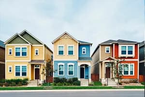
Home owners show some of the most willingness to use color for their front door. Forty-eight percent of survey respondents say their front door is painted a color – such as blue, green, red, brown, or gray.
Home owners may be hesitant about color because they just can’t decide on the right color. Twenty-four percent of respondents admit to having no eye for using color, and 40 percent say they fear that any color they did choose they would quickly grow tired of.
FOR THE COLOR PHOBIC …
Color, however, can transform an otherwise dull, forgettable room into an eye-popping, memorable one (in a good way, when used correctly!).
Accessories and accents may be less of a commitment for those scared of color. Sixty-percent of respondents say that adding throw pillows and blankets is one of the top ways they could bring color into a room; flowers are another way.
Or, for those who want to try some paint but are unsure of a palette, Better Homes and Gardens offers some help. BHG just released its Color Issue, along with its annual Color Palette of the Year. Here are their top picks for colors for 2016:

- PINK: Use it as a neutral paired with blues, blacks, and metallic accents. (Example: Benajmin Moore/Gentle Blush 2084-70)
- BLUE: Try this midtone blue, which offers a “big, gregarious personality.” (Example: Pittsburgh Paints/Smoke Bell PPG451-5)
- GRAY: Show off a classic and contemporary look. “The popular new kid on the color block isn’t going away anytime soon.” (Example: Dunn-Edwards/Foil DE6360)
- GREEN: Mix it with a hint of silver to give a space a modern retro vibe. (Example: Ralph Lauren Paint/Smoke Bekk RL1599)
- ORANGE: Love it or hate it, an energetic orange can pack some serious punch. (Example: Sherwin Williams/Tango 6649)