By Jackie Mosher, co-founder of Dzinly, and Bella Baldwin, a Dzinly designer
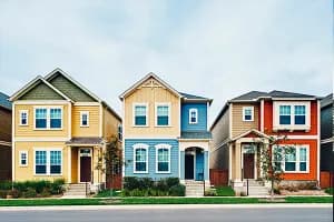
The 2025 Colors of the Year are showcasing an exciting range of shades, from bold jewel tones to soft neutrals and rich, earth-inspired hues. These colors are not just about staying on trend; they're about setting the mood, enhancing spaces and making bold statements in both interiors and exteriors. They also might give the drab curb appeal of a listing an eye-catching refresh.
Dzinly is an interactive virtual design platform that allows users to test out home exterior features and colors, including the 2025 Colors of the Year. Let’s explore the standout picks from leading paint brands, like Sherwin Williams, Benjamin Moore, Behr and more, along with ideas for how to incorporate the shades into a home’s exterior for some added curb appeal.
Sherwin Williams: 2025 Color Capsule

Sherwin Williams is shaking things up this year with a bold new approach: Instead of selecting a single Color of the Year, they created the 2025 Color Capsule—a dynamic collection of trendy color hues. This curated collection showcases a stunning spectrum of shades, from crisp whites to deep near-blacks and soft pastels to rich jewel tones.
On exteriors, shades like “Grounded,” “Malabar” and “Bosque Pear” can evoke a rustic, mountainous charm—ideal for homes surrounded by natural landscapes.
For a more traditional aesthetic, consider pairing “Rain Cloud”—a soft blue gray—with the bright, clean contrast of “White Snow” for the home’s trim. This classic combination offers a sophisticated, timeless look.
To add a pop of personality, introduce “Mauve Finery” or “Chartreuse” for a bold, eye-catching front door that can elevate curb appeal.

Dzinly’s color palette:


Dzinly’s color palette:

Benjamin Moore: Cinnamon Slate (2113-40)

“Cinnamon Slate” is a rich blend of heathered plum and velvety brown. It’s part of Benjamin Moore’s larger 2025 trend palette that includes both bold and subtle tones, like Tissue Pink and Ashwood Moss.

Cinnamon Slate can elevate curb appeal on exteriors, especially as a front door color pop. Pair it with whites that have hints of gray, like Benjamin Moore’s Cloud White or Clam, or with deeper hues, like Stone Cutter or Kendall Charcoal, for a contrasting look. It also pairs well with warm neutrals and soft greiges, such as Revere Pewter or Gray Owl, for a balanced and inviting exterior palette.

Dzinly’s color palette:

Behr: Rumors MQ1-15

“Rumors” is a rich ruby red with subtle bluish undertones. It is a timeless color that can add character and charm to a home’s exterior, making it perfect for a colonial-style front door or as a bold accent on windows and trim in a Craftsman home. To achieve a cohesive and inviting palette, consider pairing it with soft neutrals, like “Swiss Coffee” or “Pale Almond,” which can soften Rumors while maintaining a classic aesthetic. For an earthy and harmonious Craftsman-style vibe, deep greens such as Sequoia or Thyme Green can create a connection to natural surroundings.
Alternatively, for a modern yet grounded look, rich neutrals like Gray Squirrel and Smokey Trout provide a sophisticated contrast that can enhance Rumors’ warm undertones while keeping the overall design elegant and timeless. These combinations balance boldness with subtlety, offering versatility across architectural styles.

Dzinly’s color palette:

Valspar: Encore 8002-45G

“Encore” is a striking color choice for the exterior, capturing the essence of this year’s trending jewel tones. Unlike many other shades we’ve seen this year, Encore ditches the gray or smoky undertones and stands out with its unapologetically bold and vibrant presence.
For exteriors, Encore shines as a front door color on modern facades, which can add a vibrant twist to a red, white and blue colonial. It also can serve as an energetic cladding color when paired with warm, orangey wood tones and bright whites for balance. This color will make a statement wherever it’s used.

Dzinly’s color palette:

Read the second part of this post!
