
")


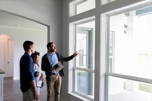
Real estate pros are often likely to recommend a fresh coat of paint before selling a home, whether that’s the entire home or at least just one interior room, according to the National Association of REALTORS®’ 2025 Remodeling Impact Report. Paint is known as one of the most affordable house projects, and it can make a big difference in the look of a home.
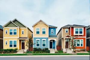
Home staging and real estate professionals have long-favored neutral colors—whites, beiges and grays—to appeal to prospective home buyers. But Sherwin-Williams color forecasters Sue Wadden and Emily Kantz—who have a hand each year in deciding the paint firm’s Colors of the Year—offer reasons why you might want to expand your color palette.
When preparing a home for sale, home stagers and real estate professionals often favor neutral colors. But that runs counter to the latest trends of bold color pops. Can you still use bold colors and sell a home?
EMILY KANTZ: Neutrals don’t have to be boring. Use a layered approach, or what I consider layered, neutral maximalism. Focus on different textures and use those complex neutrals but in the mid-tone range.

And don’t brush off deeper colors. They can bring out the beauty in a wood tone that basic white can’t. Don’t be afraid to use color if you’re selling your house. It can really emphasize an architecture feature, like playing up a stone fireplace or the natural elements around the home.
But will darker colors make a space feel smaller?
SUE WADDEN: The rules of the road have long been that lighter colors make a space feel more atmospheric and airy. You get that brightness and reflection of natural light coming in from the windows and the lighter colors can illuminate a space. But deeper colors also do things to awaken a room. Don’t be afraid of taking on that deeper color, even in a smaller space because you get that richness and a little drama. It makes the space unique and can set the home apart from others in the real estate market.

What color trends do you see breaking through the most lately?
SUE WADDEN: Whites and neutrals are always popular, but the ones to pay attention to lately are browns, like coffee brown colors. In our [2025 Color Capsule of the Year] collection, we have Grounded and a color called Clove, which are both really deep colors. These dark browns can work like a beautiful new neutral, balancing out any lightness with a richness in the space.

We’ve also seen blues and greens really start to take on this greater role as a neutral. We are seeing blues and greens in kitchen cabinets. We’re also seeing it used in full rooms, like the living room, dining room, bedroom, bathrooms and spa spaces.

Neutrals—like your whites—certainly will always be important to balance out color. But what’s interesting is the rise of deep, deep tones—including blacks. Homeowners are wanting to bring these rich colors into their homes as accent colors.
What are some unexpected ways that homeowners are using color around the home—besides just for the walls?
SUE WADDEN: There are so many ways to play with color. Maybe you don’t want to put a deep dramatic color on the walls, but you could paint your doors black, a charcoal or a deep color. It’s unique—without the full commitment of painting an entire room.
You could paint the trim a different color from the wall color. Don’t just fall back on white as your go-to trim color. Use a lighter wall color and contrast it with a darker trim, like charcoal. The look is amazing!
How does this darker color trend fit with the wellness design movement?
EMILY KANTZ: Typically, we see biophilic colors—like greens and blues—used in wellness design. We are seeing a shift toward deeper, darker colors. Darker colors can have restorative benefits, putting you in a state of relaxation. Think about it: If you have a headache, do you want to be surrounded by bright, white walls or something darker that can have a cocooning effect, letting you rest and melt your stress away? People are gravitating toward these deeper, darker colors for health and wellness.
Color drenching has become a hot trend, coating an entire room in a deeper color. But can you color drench with a deeper color while still making it timeless and not one day risk it feeling sooo 2025?
EMILY KANTZ: Certainly! Maybe you choose a merlot in your home office and use it for your wall, ceiling, trim and doors. Think about the sheen of the color because that plays a role. The sheen may be different for the trim as opposed to the ceiling. Different sheens can help add depth and interest when looking at the full room application [of one color].
Or, color drenching may mean embracing a single color for architectural detailing. You can have a color drench moment for a built-in or bookcase. Drenching can make elements pop off the shelf and offer an unexpected, all-over color moment.