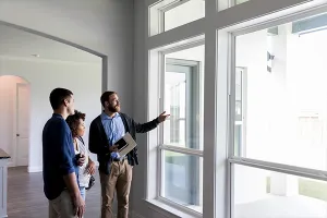
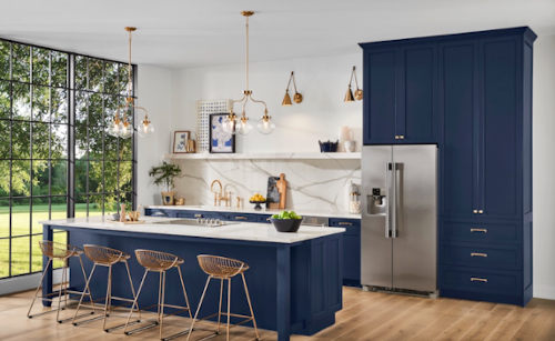
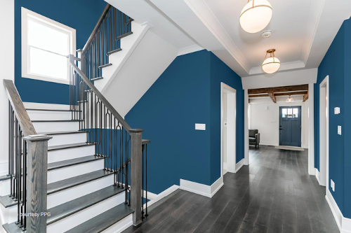
Pantone made a simple choice with "Classic Blue" as its 2020 Color of the Year. The paint company describes the color—which is remarkably close to REALTOR® Blue—as the "sky at dusk," "timeless," "easily relatable," and "restful." The color is being shown prominently on walls, rugs, decorative pillow accents, and kitchen cabinets.
4. Behr: Back to Nature
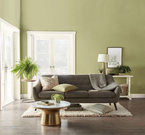
Behr's top color pick for 2020 is a meadow-inspired green called "Back to Nature." The yellow-based, greenish hue aims to give the illusion of bringing the outdoors inside, whether splashed on a living room wall or bedroom throw pillow.
5. Benjamin Moore: First Light
Photo credit: Benjamin Moore
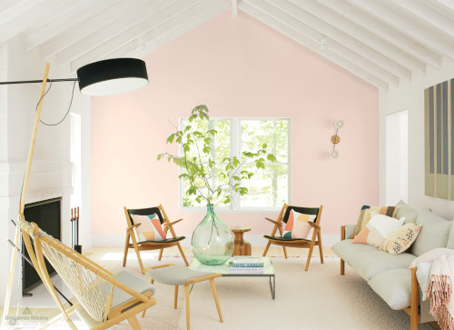
Benjamin Moore chose "First Light," a soft, rosy color that follows the rising popularity of pinks and blushes. "First Light reflects a new definition of the home—a shift in mindset from the material to satisfying the core needs in life: community, comfort, security, self-expression, authenticity," says Andrea Magno, Benjamin Moore's director of color marketing and development.
6. HGTV Home by Sherwin Williams: Romance
Photo credit: HGTV Home by Sherwin Williams
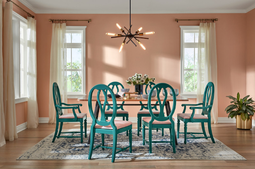
HGTV Home also jumped on the pink trend with "Romance," a soft, dusty shade. It has been shown as an accent against blues or as a dominant color on walls or furniture. The pale pink is a versatile color reminiscent of rose gold and rose copper, the company says.
7. Graham & Brown: Adeline
Photo credit: Graham & Brown
The British wallpaper company Graham & Brown offered a deep green hue called "Adeline" as its pick for 2020 Color of the Year. It's a hunter green shade and yet another nod to the natural world.
8. Dunn-Edwards: Minty Fresh
Photo Credit: Dunn-Edwards
Pastels are trending, and that's why Dunn-Edwards chose "Minty Fresh," a soft green that is meant to have a nostalgic 1950s feel. The company says the relaxing pastel evokes "calm" and "clean."
9. Pratt & Lambert: Songbird
Photo credit: Pratt & Lambert
Pratt & Lambert also went with a mint shade called "Songbird," a color it refers to as "youthful" and "optimistic." They predict a growth in botanical hues and chalky pastels in 2020. "Luxury and design are being looked at in a new light, with the influence of Hygge and pairing back movement. Our 2020 trending colors are a perfect example of this balance—a blend of glamorous jewel hues grounded by neutral tones," says Ashley Banbury, senior color designer for Pratt & Lambert Paints.
10. Kelly Moore: Sun God
Photo credit: Kelly Moore
The paint brand Kelly Moore went bright and sunny with its choice of "Sun God." Kelly Moore describes the color as "a brash, brassy yellow" that sets out to disrupt "white rooms and monochromatic schemes" with a powerful color punch. The firm predicts bright yellow to show up on everything from faucets and cabinets to upholstery and accent walls. "It's a fresh accent color that pairs with neutrals just as well as pink has over the past few years, but the look is more bold and grown-up," the company says.
11. Valspar: 12 Nature-Inspired Colors