


Because housing is a big part of many Americans’ financial wellbeing the ability to access homeownership – housing affordability – is an important topic. The National Association of REALTORS® (NAR) Housing Affordability Index is a great way to understand how affordable the housing market is or isn’t for the typical home buyer and how that compares over time. However, it has a few shortcomings. First, not everyone is the typical home buyer. While looking at median family income is a good representation of the middle of the market, the situation for those with incomes above or below the median family income can look quite different. Second, the NAR Housing Affordability Index uses home sale prices to determine affordability, so it’s backward looking. We know what affordability was, but what about the affordability of housing inventory that is active on the market right now?
To answer these questions, the NAR Research Group and REALTOR.COM partnered to do an analysis of affordability at different income levels for all active inventory on the market. First, we have a summary measure—the Realtors® Affordability Score —that summarizes affordability conditions for different income levels in a single measure for each state and the 100 largest metropolitan areas. Like the Housing Affordability Index, the Realtors® Affordability Score is useful for highlighting overall trends in affordability over time. Another measure of affordability is the Realtors® Affordability Distribution Curve. With the distribution curve, we can zoom into certain income segments of the market and see how many houses are affordable to those in a particular income group.
Housing Affordability in March 2018
Nationwide, housing affordability declined compared to a year earlier.
A typical household can afford nearly 40 percent of the active housing inventory.
In March 2018 the Realtors® Affordability Score for the U.S. was 0.84[1], which means that households in many income percentiles can afford a smaller share of houses on the market than their income percentile. For instance, while 42 percent of households earn $35,000-$50,000, they can afford about 31 percent of homes that are currently for sale. However, they should be able to afford 42 percent under ideal housing conditions. The US Affordability Score decreased from 0.86 in March 2017, due to rising prices across the country and rising mortgage rates that occurred.
State level affordability
Midwest states have some of the most accessible housing markets in the US. Out of the 50 states and DC, 28 have scores greater than the US score. Of these states 80 percent are located in the Midwest and South region. In many of these areas, rising home prices have almost priced the lower-income population out of the market.
According to the data for the month of March, the top five most affordable states are:
- Ohio (1.12),
- Indiana (1.09),
- Kansas (1.09),
- Iowa (1.07), and
- West Virginia (1.05)
In the areas above, a typical household can afford 54 to 62 percent of the active housing inventory.
On the other side of the spectrum, the top five least affordable states are:
- Hawaii (0.52),
- California (0.57),
- Oregon (0.60), and
- the District of Columbia, Montana and Rhode Island (all at 0.64)
In the areas above, a typical household can afford 19 to 23 percent of the active housing inventory.
Metropolitan area level Affordability
In March, 45 percent of the 100 largest metro areas had a lower affordability than the nationwide. Meanwhile, 35 percent of these metro areas had improved affordability compared to a year earlier. See below the top five most and least affordable metro areas:
Most Affordable metro areas
In the following areas, the typical household can afford 62 to 74 percent of the homes that are currently on the market.
- Youngstown-Warren et al., OH-PA (1.25),
- Dayton, OH (1.19)
- Toledo, OH (1.18)
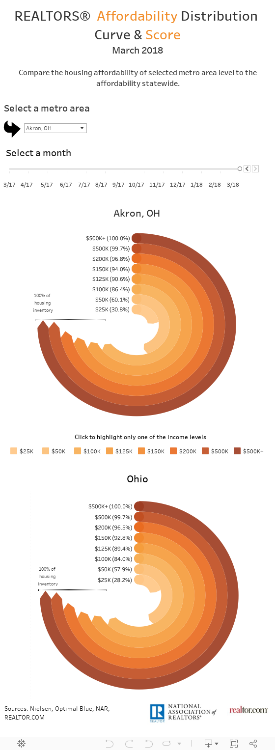
- Akron, OH (1.16)
- Scranton—Wikes-Barre et al., PA (1.11)
Least affordable metro areas
In the following areas, the typical household can only afford 3 to 11 percent of the active housing inventory.
- Los Angeles-Long Beach et al, CA (0.35)
- San Diego-Carlsbad, CA (0.37)
- San Jose-Sunnyvale et al., CA (0.43)
- Oxnard-Thousands Oaks-Ventura, CA (0.45)
- San Francisco-Oakland et al, CA (0.48)
The visualization below allows you to see the share of homes that households at different income levels can afford to buy.
For more information, view the Realtors® Affordability Distribution Curve and Score data page >
[1] Score=0, no household can afford any of homes on the market.
Score=1, homes on the market are affordable to households in proportion to their income distribution.
Score=2, all households can afford all homes on the market.
